

So, you’re a real estate agent in Wollongong and your website kinda sucks? Or worse – you don’t have one at all?
Yikes.
Don’t worry, you’re not alone. Plenty of local agents are relying on outdated websites (or Facebook pages – stop it) and wondering why leads are ghosting them. But here’s the hard truth: in 2025, if your site isn’t doing anything – aka attracting, converting, and impressing – you’re not just behind… you’re invisible.
Now, before you sprint off to some generic website builder with a ‘Real Estate Starter Pack’, here’s what you need to know:
We’re a Wollongong-based web design agency and digital marketing agency who’ve worked with plenty of real estate clients, and we’ll be real with you – we prefer WordPress. It’s scalable, SEO-friendly, and doesn’t box you in. (Here’s why WordPress wins for real estate websites if you want the deep dive.)
But platform aside, your site needs the right design. One that makes you look legit, not like you whipped it up at 2am with clipart and hope.
This article’s your blueprint: 5 website design styles that actually move the needle for real estate businesses in Wollongong.
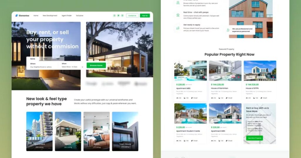
What Makes a Real Estate Website Actually Work?
Before we get into design ideas, let’s clarify what separates a nice-looking website from one that gets results.
- Fast, mobile-friendly design that works just as well on a phone as it does on a laptop.
- Clean navigation and filtering, so users can find properties quickly.
- Visual impact through high-res images, virtual tours, or videos.
- Clear calls to action, like “Book a viewing” or “Request a callback.”
- Social proof, like reviews, recent sales, or agent profiles.
- SEO basics covered – so people can find you when they Google “real estate agent Wollongong.”
These aren’t extras – they’re essentials. Every design idea below takes those into account.
Top 5 Website Designs for Real Estate Agencies
Choosing the right website design can significantly impact your real estate business’s success. Here are the top 5 website designs that have proven effective for real estate businesses in Wollongong, each offering unique features to enhance user experience and drive conversions.
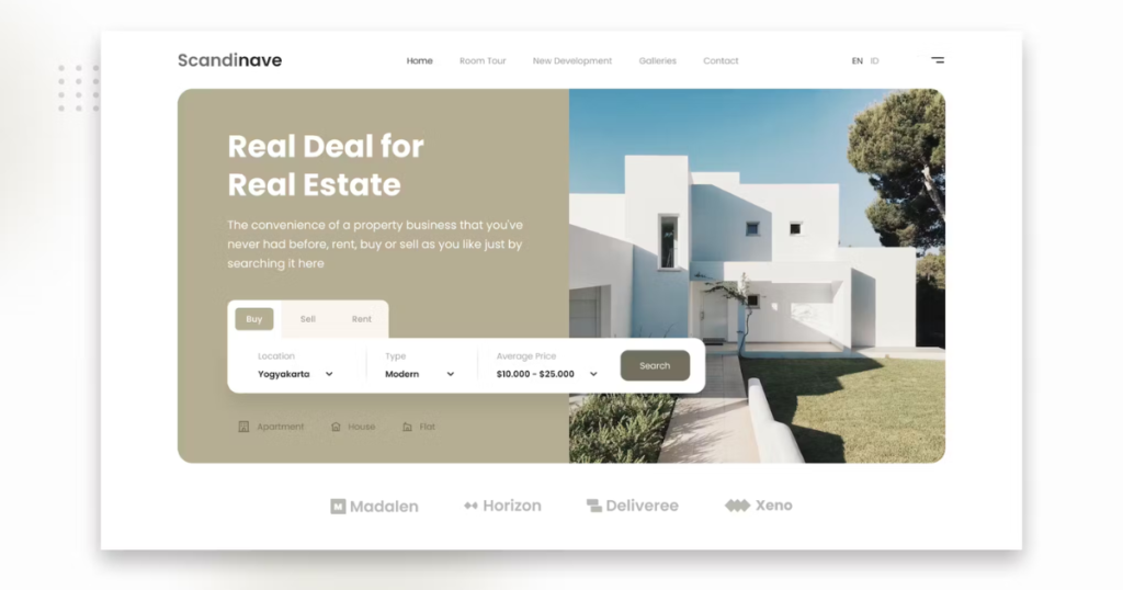
1. The Modern Minimalist
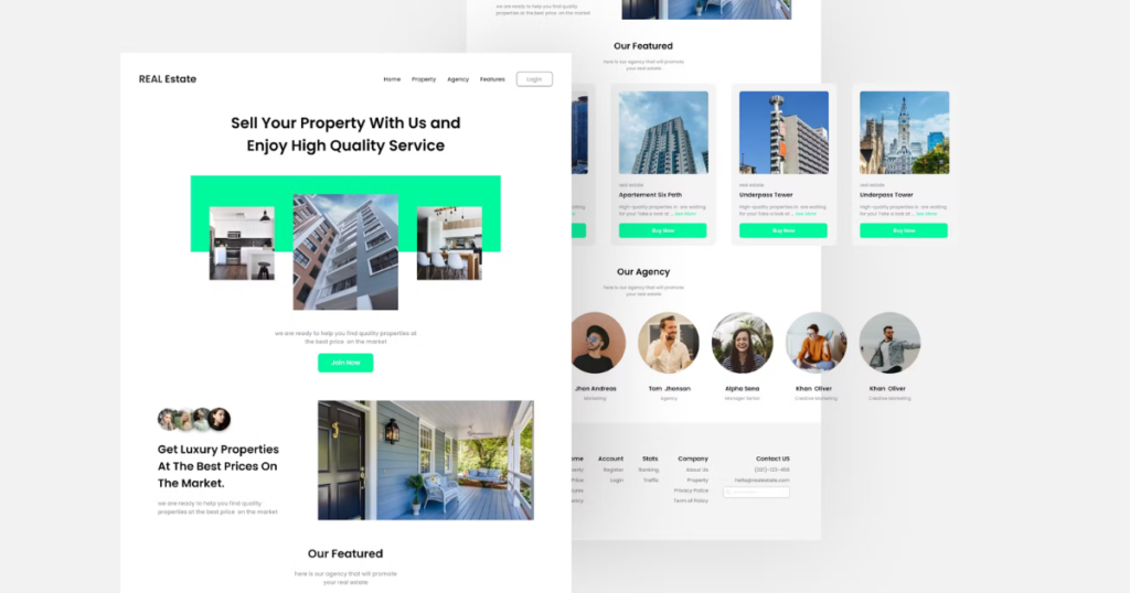
Think clean layouts, big property photos, and no distractions. This style is ideal if you want a polished brand presence that feels high-end – even if you’re a solo operator.
Best for: Agencies who want a strong first impression with less clutter.
How to implement it: Start with a template that’s built around bold visuals and whitespace. Avoid heavy colours, too many links, or small fonts. The goal is to make browsing property listings feel effortless.
Want to know how we apply this approach using Elementor? Check out How to Maximise Web Design Impact with Royal Elementor Addons.
2. The Interactive Map Layout
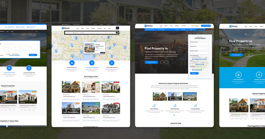
OGive users the ability to browse listings via a real-time map. This is super helpful for buyers searching by suburb or proximity to local amenities.
Best for: Agencies with a large number of listings across the Illawarra.
How to implement it: Use Google Maps or a plugin like Mapbox to overlay your listings on a map. Bonus points for filter options that let people sort by budget, bedrooms, and location.
If you’re using WordPress (which we recommend – here’s why in our WordPress vs Squarespace for SEO post), it’s easy to integrate with third-party property tools.
3. The Virtual Tour Site
Virtual tours are no longer a “nice to have” – they’re a must-have for many buyers, especially if you’re selling to out-of-area clients.
Best for: Premium listings, off-the-plan developments, or rural properties where travel might be a barrier.
How to implement it: Use services like Matterport or upload high-quality video walkthroughs to YouTube and embed them directly into your listing pages. Pair it with detailed image galleries and floor plans to give users the full picture.
4. The Content-Rich Blog Site
A blog isn’t just for SEO (although it definitely helps with that). It also builds trust and positions your agency as a local expert.
Best for: Agencies that want to rank higher on Google and educate their audience.
How to implement it: Start by publishing one blog per fortnight on local insights, buying/selling tips, or suburb profiles. Then link relevant listings or landing pages in each post.
If you’re not sure where to start with blogging, our 7 Things to Consider Before You Outsource Your New Website post covers content planning and outsourcing tips.
5. The Testimonial-Powered Design
Overview:
ThiIf you’ve got happy clients, you should be shouting it from the rooftops (or at least putting it on your homepage).
Best for: Building trust and converting traffic.
How to implement it: Create a dedicated testimonials page and sprinkle video reviews or case studies throughout your homepage and listings. If you’re on WordPress, plugins like Strong Testimonials or Jetpack make this easy.
You can also pull in live Google reviews or link to RateMyAgent to build additional trust.
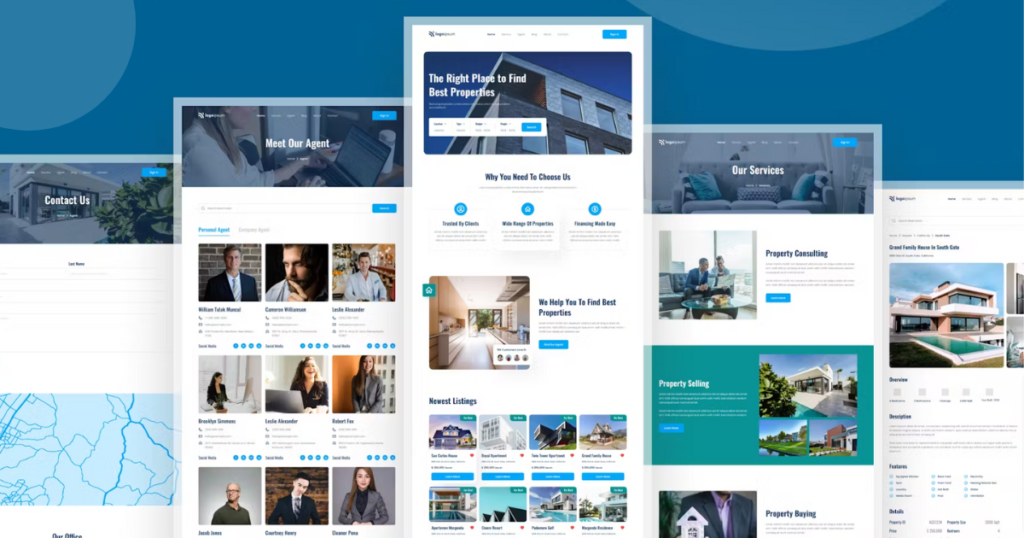
Bonus Tip: Make Sure Your Website Is Actually Working for You
A beautiful site means nothing if it doesn’t bring in leads. That’s where our digital marketing team in Wollongong comes in.
We can help you:
- Optimise your site for search (especially “real estate agent + suburb” keywords)
- Run targeted Google Ads or Facebook campaigns
- Build custom landing pages that convert
Not sure if you’re ready for a full overhaul? Let’s start with a quick audit of your current site and talk through options.
Ready to Build a Better Real Estate Website?
At the end of the day, your website should be your hardest-working employee – selling your services 24/7, answering client questions, and building your reputation.
If your current site isn’t doing that, it’s time for a change.
We’re a Wollongong-based web design agency that knows real estate. Whether you need a quick refresh or a ground-up rebuild, we can help you launch a site that looks better, loads faster, and converts like it should.
Want to see what that looks like? Let’s chat.